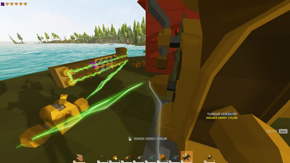
Is there a way to change the colour displayed on the display block ? currently it seems to be white when off and green when powered.
Energy seems to have a maximum amount of connections too, a large generator has 170+ energy remaining but cant power more than around 10 display blocks (I'm assuming) due to its other connections, a new generator with no other connections can power more blocks with no alterations to their connections apart from the generator they're connected too.
I've since confirmed something I mentioned in my list too, if I have 1 generator connected to a set up and has 5 drain, then add another generator it also has 5 drain so using multiple generators through an energy and connector is currently pointless meaning I could build 10 generators and power no more than I could with 1 and that we would need multiple generators and circuits across a build instead of 1 power location.
A couple of suggestions in the same area
Charge gauge
A gauge on screen for any item being used that requires a charge, just a small marker with a needle showing from empty to full so we have some idea whats going on instead of having to check it in the inventory.
Energy nodes/splitter etc (images included 1 generator without and node, then each generator through and node) (images showing how regardless of remaining energy in generator it stops flowing. Reason assumed to be the amount of connections)
These things are HUGE being able to connect multiples to a normal node would be nice, or its setting up a series of splitters to splitters to splitters to spread out the energy and they take up so much space and get so messy! The small switches also have no indication which way the levers going to move even though it only moves to one side. Either a smaller thing such as a 1x1x1 cube with 1 side a colour and 2 others another colour or show energy in/out rather than the current set up or a junction box of 2x2x2 (or whatever) where inside we can set up power connections and splitters without having them individually across our build.
Cold energy
If you have ice blocks in the distance and an energy bean near you which you can look through towards the ice, the energy will appear behind the ice blocks.
The recharger is enormous
Not much about this really, it's just of gigantic proportions which makes it rather annoying, a bit smaller would be nice even if it's just height wise and its still the same floor space.
Propeller pack is OP
As much as in some ways I love how easy it makes the game, perhaps just add a charge to it, even if its a high figure just so there's a chance it could run out and something so you still have to pay attention when you're using it instead of an airborne untouchable angel of death.
Is there a way to change the colour displayed on the display block ? currently it seems to be white when off and green when powered.
Energy seems to have a maximum amount of connections too, a large generator has 170+ energy remaining but cant power more than around 10 display blocks (I'm assuming) due to its other connections, a new generator with no other connections can power more blocks with no alterations to their connections apart from the generator they're connected too.
I've since confirmed something I mentioned in my list too, if I have 1 generator connected to a set up and has 5 drain, then add another generator it also has 5 drain so using multiple generators through an energy and connector is currently pointless meaning I could build 10 generators and power no more than I could with 1 and that we would need multiple generators and circuits across a build instead of 1 power location.
A couple of suggestions in the same area
A gauge on screen for any item being used that requires a charge, just a small marker with a needle showing from empty to full so we have some idea whats going on instead of having to check it in the inventory.
These things are HUGE being able to connect multiples to a normal node would be nice, or its setting up a series of splitters to splitters to splitters to spread out the energy and they take up so much space and get so messy! The small switches also have no indication which way the levers going to move even though it only moves to one side. Either a smaller thing such as a 1x1x1 cube with 1 side a colour and 2 others another colour or show energy in/out rather than the current set up or a junction box of 2x2x2 (or whatever) where inside we can set up power connections and splitters without having them individually across our build.
If you have ice blocks in the distance and an energy bean near you which you can look through towards the ice, the energy will appear behind the ice blocks.
Not much about this really, it's just of gigantic proportions which makes it rather annoying, a bit smaller would be nice even if it's just height wise and its still the same floor space.
As much as in some ways I love how easy it makes the game, perhaps just add a charge to it, even if its a high figure just so there's a chance it could run out and something so you still have to pay attention when you're using it instead of an airborne untouchable angel of death.

Edited by leo_chaosadded images
Share this post
Link to post
Share on other sites